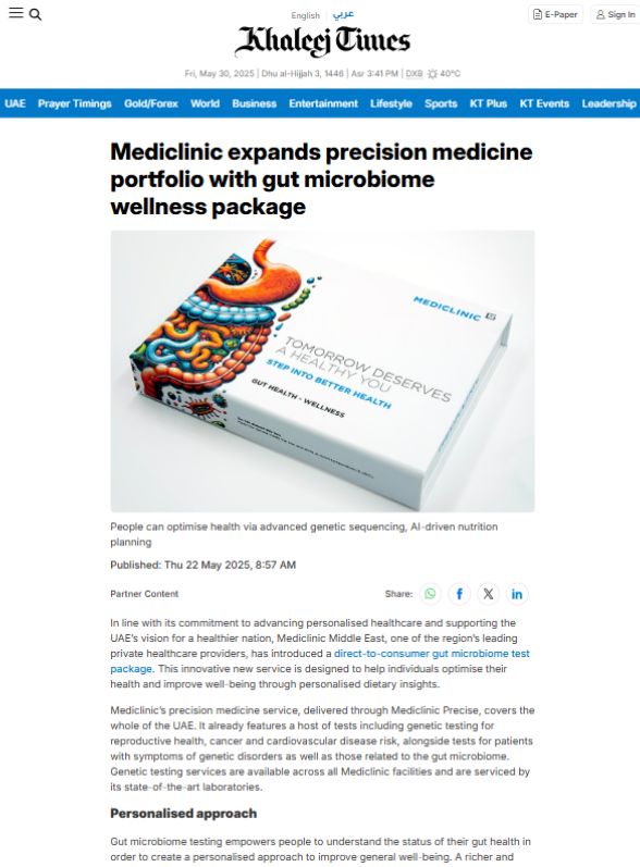
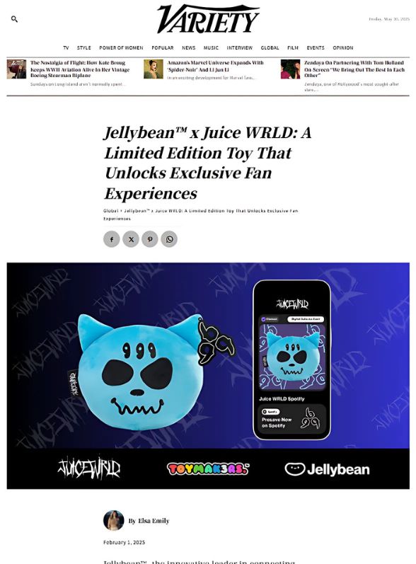
When crafting a press release, every detail matters. From the headline to the final paragraph, every word and formatting choice you make contributes to the effectiveness of your message. One often overlooked, yet crucial element in press release formatting is the choice of font. The right font for press release can help enhance readability, set the tone, and improve your chances of being taken seriously by journalists and media outlets.
In this guide, we’ll explore the significance of selecting the right font, why it matters, and which fonts are most suitable for press releases. Whether you are a PR professional, a business owner, or a media relations manager, this article will equip you with everything you need to choose the best font for your press release.
Table of Contents
Why the Right Font Matters
You might be wondering: why does font matter so much in a press release? After all, the content is what journalists care about, right? While the content is undoubtedly the most important aspect, the presentation also plays a significant role in how your message is perceived.
Here are a few reasons why selecting the right font is important:
- Legibility: A press release must be easy to read. Journalists and editors receive numerous press releases daily, so making sure your press release stands out with clear, readable fonts can make a huge difference in whether it’s noticed or ignored.
- Professionalism: The font you choose conveys professionalism. A sloppy or overly decorative font can make your press release look unprofessional, which could hurt your credibility. A clean and professional font reinforces the seriousness of the content.
- Brand Consistency: Consistency is key to maintaining a cohesive brand identity. Choosing a font that aligns with your company’s brand can help strengthen brand recognition and create a consistent experience across all your communication channels.
- Tone Setting: Different fonts can subtly influence the tone of your message. For example, a serif font can convey tradition and authority, while a sans-serif font may be seen as modern and approachable. The tone of your press release is essential in helping your audience connect with the message.
- Reader Focus: A well-chosen font will keep the reader’s focus on the message rather than distracting them with poor design choices. A font that’s too ornate or difficult to read can cause the reader to disengage.
Key Considerations for Choosing a Font for Press Release
When selecting the font for your press release, there are several factors you should keep in mind to ensure it’s both effective and appropriate for your audience:
1. Readability
The primary goal of a press release is to communicate important information quickly and clearly. A font that is difficult to read or requires extra effort to decode will turn off your reader. Aim for simplicity and clarity.
Some commonly recommended fonts for press releases include:
- Arial
- Times New Roman
- Verdana
- Helvetica
These fonts are widely used because they are easy to read on both screen and print, ensuring that your press release can be quickly scanned for key information.
2. Font Size
While selecting the right font is essential, the font size is equally important. Generally, a font size between 10-12 point is ideal for press releases. Anything too large can make your press release look unprofessional, while anything too small can make it difficult to read.
Keep the font size consistent throughout the document, but consider slightly larger sizes for headlines or subheadings to guide the reader through the content.
3. Serif vs. Sans-serif Fonts
The debate between serif and sans-serif fonts has been ongoing for years, but the general consensus is clear: both types of fonts have their place, and choosing the right one depends on the context of the press release.
- Serif Fonts: Fonts like Times New Roman and Georgia have little “feet” or “tails” at the end of each letter stroke, which can give a more formal, traditional look. These fonts are often favored in the world of print media and are great for conveying authority and professionalism.
- Sans-serif Fonts: Fonts like Arial, Helvetica, and Calibri are clean and modern, with no “feet” on the letters. They are often preferred for digital content because they tend to render more clearly on screens. They also tend to be seen as more approachable and contemporary.
For press releases, it is common to see a mix of both font types: serif fonts for the body text and sans-serif fonts for the headline, making it stand out and enhancing readability.
4. Brand Alignment
Every company has its own brand identity, and the font you choose should align with that. If your brand uses a particular font in its logo or across its website and marketing materials, you should use the same font or a similar one for consistency.
However, it’s essential not to choose overly decorative fonts that may make your press release harder to read. Stick to fonts that are professional and easy to comprehend.
5. Format and Style
Ensure that your font is styled consistently throughout the press release. This means using bold for headings, italics for emphasis (sparingly), and regular text for body copy. Avoid overusing capital letters, as they can come across as shouting and can reduce the professional tone of your press release.
Recommended Fonts for Press Releases
While there are many fonts available, some are specifically known for their clarity and professional appeal. Here are some of the top choices:
1. Arial
Arial is a widely used sans-serif font known for its simplicity and readability. It’s an excellent choice for press releases as it’s clean and modern. Arial is ideal for digital releases and works well for both headlines and body text.
2. Times New Roman
Times New Roman is a classic serif font that has been used in professional documents for years. It’s the go-to font for many press releases, especially in print media. It’s formal, traditional, and professional, making it an excellent choice for press releases that need to convey a sense of authority.
3. Helvetica
Helvetica is a versatile sans-serif font known for its clarity and neutrality. It’s a clean, modern font that’s perfect for digital and printed press releases alike. Its widespread use in corporate communication speaks to its effectiveness.
4. Georgia
Georgia is a serif font designed for easy readability on digital screens. It’s less formal than Times New Roman but still retains a sense of professionalism. If your press release is likely to be viewed primarily online, Georgia is a great choice.
5. Calibri
Calibri is a sans-serif font that’s clean and contemporary. It’s often used in modern office environments and is particularly well-suited for digital press releases. It’s straightforward, easy to read, and works well for both the body and headings.
Tips for Formatting Your Press Release
In addition to font choice, formatting is crucial when preparing your press release. Follow these basic formatting tips to enhance the professionalism of your document:
- Headline: Use a larger font size (typically 14-16 point) for the headline to make it stand out. Make sure your headline is concise and attention-grabbing.
- Body Text: Use a standard font size of 10-12 points for the body of your press release. Stick to a single, readable font like Arial or Times New Roman.
- Paragraphs and Spacing: Keep your paragraphs short and concise. Use single spacing and leave a space between paragraphs to improve readability.
- Date and Location: The date and location should appear at the beginning of the press release. Use a slightly larger font size for these details to make them stand out.
- Contact Information: At the end of the release, include the contact information in a simple and clear format, ensuring it’s easy for journalists to reach out for more information.
Final Thoughts
Selecting the right font for your press release is crucial to creating a professional, readable, and visually appealing document. Whether you choose a classic serif font like Times New Roman or a modern sans-serif like Arial, make sure it aligns with your brand and enhances the clarity of your message. A well-chosen font will make your press release stand out in the crowded world of media communications.
By following these best practices and using the recommended fonts, you can ensure that your press release makes a positive impression on journalists, editors, and readers alike.


